
Best Color to Wear for Family Beach Pictures

When a family steps onto the sand for portraits, clothing becomes part of the story. The best color to wear for family beach pictures is rarely one single shade. It is a palette that feels soft, coordinated, and true to your family while letting the shoreline, light, and connection remain the focus.
At the beach, color behaves differently than it does in a studio or backyard session. Sunlight is brighter, water reflects cool tones, and sand adds warmth. What looks bold on a hanger can photograph louder than expected, while a gentle neutral can feel elegant and timeless. That is why choosing what to wear deserves the same care as choosing the date, location, and photographer.
What is the best color to wear for family beach pictures?
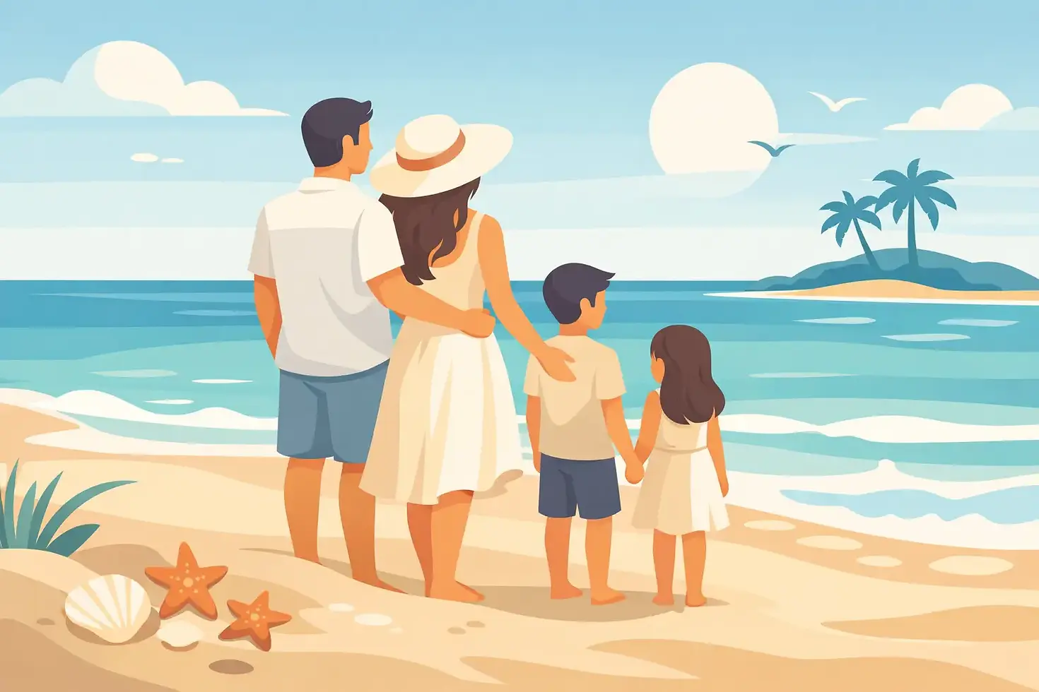
If you want the most reliable answer, soft neutrals and muted coastal tones tend to photograph best. Cream, ivory, sand, soft white, beige, tan, dusty blue, sage, pale blush, and light gray all work beautifully on the beach. These colors complement the natural setting instead of competing with it.
Soft blues echo the water and sky without blending in too much, especially when the tone has a little depth. Sandy neutrals feel effortless and refined, which is why they remain a favorite for heirloom-style portraits. Gentle greens and blush tones add personality while still feeling understated.
White is often the first color families consider, and it can be lovely, but it depends on the fabric and styling. A bright optic white can sometimes feel harsh in full sun, while cream or ivory usually appears richer and more flattering. Texture also matters. Linen, cotton gauze, chiffon, and other soft fabrics give light colors movement and depth, which helps portraits feel polished rather than flat.
Why soft, muted colors work so well at the beach
Beach portraits are at their most beautiful when they feel airy, connected, and natural. Soft color palettes support that mood. They reflect light gently, flatter a wide range of skin tones, and keep attention where it belongs - on faces, expression, and relationship.
Muted colors also age well. Families often want beach portraits to live beyond a holiday card or social media post. They want artwork that still feels beautiful years from now. Trend-driven neons, ultra-saturated brights, or heavy contrast can date a gallery quickly. A calmer palette creates the timeless quality many families are hoping for when they invest in portraits.
There is also a practical reason. On a beach, the background is already visually active. You have waves, horizon lines, sea oats, bright sky, and changing sunset color. Clothing does not need to do more. It needs to balance the scene.
The best color combinations for family beach portraits
Rather than putting every person in the exact same shade, aim for coordination with variation. A family dressed in layered neutrals and soft coastal hues usually photographs more beautifully than a group in identical white shirts and denim.
One of the easiest combinations is cream, tan, and dusty blue. It feels coastal without being overly themed and works well from spring through early fall. Another strong option is ivory, sage, and soft khaki, which looks especially elegant in dune settings. For families who want a hint of warmth, blush, oatmeal, and light blue create a gentle, flattering mix.
If your session is timed for sunset, consider colors that catch the evening light well. Warm neutrals, soft peach, muted rose, and sandy beige can feel especially luminous as the sun drops. For a crisper morning look, pale blue, ivory, and light gray often feel fresh and clean.
The goal is not perfection through matching. It is visual harmony. Think of your group as one complete composition rather than a collection of separate outfits.
Colors to avoid for beach family photos
Some shades are simply harder to photograph in a beach setting. Neon colors tend to cast bright reflections onto skin and can overpower the softness of the coast. Very dark black can feel heavy against a light, airy background, especially in daytime sessions. That does not mean navy or charcoal are off limits, but they are often best used sparingly rather than worn by the entire group.
Bold red can also be tricky. It draws the eye immediately, which may not be ideal if one person becomes the visual center of every image. Strong patterns can create a similar issue. Large florals, busy prints, logos, and high-contrast stripes usually distract from connection and date a portrait more quickly.
Pure white can be beautiful, as mentioned earlier, but only when styled thoughtfully. In harsh light, it may lose detail if the fabric is too bright or stiff. Choosing softer shades of white and fabrics with natural texture makes a noticeable difference.
How to choose colors for your specific family
The best color to wear for family beach pictures also depends on who is being photographed. A family with young children may want a palette that feels easy, playful, and comfortable. A multi-generational session may call for something more elevated and balanced across many ages and skin tones.
Start with one anchor outfit, often mom's dress or the look that sets the mood most clearly. From there, build supporting colors around it. If the anchor piece is a flowy ivory dress with subtle blue patterning, other family members can wear solids in complementary tones like tan, slate blue, or soft cream.
Consider skin tone and hair color as well. Warm complexions often glow in cream, camel, blush, and sage. Cooler complexions can look especially lovely in soft blue, lavender-gray, and airy neutrals. If someone tends to look washed out in pale shades, add a little depth through a medium muted tone rather than jumping straight to black.
Children usually photograph best in simple, comfortable clothing with movement. Soft dresses, linen sets, and lightweight button-downs feel classic and photograph well in the breeze. If a child is uncomfortable, that will always show more than the color choice.
Styling beyond color matters just as much
Even the best palette can fall flat if the styling feels too stiff or too busy. Beach portraits benefit from breathable fabrics, graceful movement, and silhouettes that suit the setting. Linen, cotton, gauze, and soft blends create beautiful texture and help clothing feel relaxed but elevated.
Try to avoid overly structured pieces that fight the environment. A fitted business shirt or heavy formal fabric can feel disconnected from the shoreline. Instead, look for pieces that move naturally and feel at home in the coastal light.
Bare feet are often the most natural choice, and accessories should stay minimal. A simple hair ribbon, delicate jewelry, or a woven hat can work well if it feels intentional. Too many accessories can pull attention away from faces and connection.
This is also where professional guidance becomes valuable. At Coastal Heirloom Studio, wardrobe planning is part of creating portraits that feel refined, personal, and lasting. The right clothing does not just photograph beautifully. It helps everyone feel more confident in front of the camera.
Seasonal light changes the palette slightly
Not every beach session looks the same, even in the same location. Spring often pairs beautifully with soft greens, pale blues, blush, and creamy neutrals. Summer can handle a bit more warmth in the palette, such as sand, oatmeal, terracotta-pink, or muted aqua, as long as tones remain softened.
Fall beach portraits often look especially beautiful in richer neutrals like taupe, camel, dusty sage, and soft rust used sparingly. During winter on the coast, cooler neutrals and layered textures can feel elegant and serene.
Light matters as much as season. Golden hour tends to soften everything and flatter warmer tones, while earlier light can make cooler shades feel especially crisp. If you are choosing between two palettes, think about the time of day your session will take place.
A simple way to get it right
If you feel stuck, keep it simple. Choose two or three soft colors, vary the shades slightly, and prioritize texture over pattern. Let one outfit lead and let the rest support it. When in doubt, cream, tan, and a muted coastal blue are hard to regret.
The most meaningful family portraits are not remembered because everyone wore the exact trend of the moment. They are remembered because the images feel like your family - relaxed, connected, and beautifully at home by the water. When your colors support that feeling, the portraits become more than seasonal pictures. They become part of your family's visual legacy.
The best outfit choice is the one that feels timeless in your home and natural on your family, long after the sand has been brushed away.


Comments